Brand logos are undoubtedly one of the most critical components of a strong brand identity. However, designing a memorable logo that resonates with your target audience and effectively communicates your brand message can be challenging.

In this post, you’ll discover 20 brand logos that have achieved global recognition and embody the essence of their respective brands.
You’ll also explore how these designs have evolved and examine what makes them incredibly compelling.
Table of Contents
20 Brand Logo Examples
Not sure what it takes to create a killer brand logo? Here are 20 examples to inspire your future design projects.
1. McDonald’s

2. Amazon
![]()
![]()
3. Levis
4. Shell
![]()
![]()
Sometimes, unexpected ideas and elements can bring added depth to your brand’s visual identity.
5. Microsoft

6. Apple
7. Starbucks
![]()
![]()
8. Twitter

Twitter has come a long way from its humble beginnings in 2006. While the company was initially started as a side project for a podcast platform called Odeo, it quickly became a massive success, with over 1 million total users barely two years later.
Fast forward to today, and Twitter is one of the largest tech companies in the world, worth around $14 billion (as of the time it was acquired).
The journey to develop its logo has also been fascinating. The first iteration of Twitter’s logo featured a green color palette and a text-only design; however, this design never truly saw the light of day.
By the time Twitter was launched to the public in 2006, Linda Gavin had developed a new iteration of the logo (interestingly in a single day). While this iteration retained the text-only format, it departed from the previous green palette and adopted a single shade of blue instead.
In a subsequent redesign, the Twitter logo underwent further changes, incorporating the iconic “Larry the Bird” element alongside the text. And today, Larry takes center stage thanks to a 2012 redesign that opted for a more simplified design approach.
What we like: Twitter has always taken a more simplistic, no-frills design approach right from the start. This has allowed them to maintain consistency in their designs over the years.
Pro tip: Twitter‘s design approach perfectly matches the core principles of its platform — simplicity, brevity, and impactful communication. When creating your designs, consider how you can also convey your brand’s message, principles, or identity.
9. Nike
![]()
![]()
Image Source
Nike started in 1964 as Blue Ribbon Sports — a joint venture between track and field coach Bill Bowerman and one of his former students, Phil Knight. The name Nike was introduced in 1971, a year before the brand’s shoes were launched.
In the years since then, Nike has introduced the iconic “Just Do It” slogan, launched some of the most successful collaborations, and established itself as one of the industry’s most recognizable brands.
Now, while one of the most recognizable elements of the Nike brand is its logo, the first-ever iteration of the brand logo in 1964 was a wordmark featuring the name “Blue Ribbon Sports” — the name of the brand at the time.
However, once the brand name was changed in 1971, the swoosh we all know and love was introduced, albeit with the “Nike” superimposed.
By 1995, the brand had become so recognizable that the company decided to undergo a significant redesign by removing the word “Nike” and leaving only the iconic Swoosh as the primary element.
This version is still in use, with subtle modifications in 1999 to enhance the Swoosh.
What we like: The decision to remove the name from the logo showed Nike’s deep understanding of its brand equity and a strong belief that the Swoosh could stand on its own as a powerful representation of the brand.
Pro tip: Like Twitter and Apple, Nike is another excellent example of how a brand image can become integral to brand identity. When designing your logo, consider using unique visual elements that could potentially become representative of your brand.
10. Coca-Cola
Image Source
Coca-Cola has come a long way from serving 9 drinks a day in 1886 to 1.9 billion daily servings as of 2020. What started as a small operation at the Jacobs’ Pharmacy in Atlanta is now a multi-billion dollar multinational.
Similarly, its logo has undergone several changes over the company’s 130-year history. The first version of the Coca-Cola script logo was designed by Frank M Robinson, who interestingly happened to be the bookkeeper to Coca-Cola’s inventor Dr. John S Pemberton.
A couple of years later, in 1893, this logo was updated to include the text “Trademark” within the tail of the “C” in “Coca” after a trademark for the product was granted by the U.S. Patent Office.
However, not even 3 years later, the logo underwent a dramatic redesign, which made the text more dramatic with curved lettering and swirls. This was short-lived and eventually changed a year later.
1947 saw the creation of the Coca-Cola red disc, which marked the introduction of the “red and white” color scheme.
While there have been several redesigns since then, the current logo iteration retains this element in combination with the elegant typography synonymous with the first-ever iterations of the logo.
What we like: The current iteration of Coca-Cola’s logo was developed as part of a unified branding strategy that uses the classic Red Disc logo design to unite its offerings (Classic, Diet, and No-Sugar) under a single “family.”
Pro tip: When designing a logo for a business with multiple offerings, consider incorporating elements from the brand’s history, identity, or other defining aspects that can serve as unifying elements within the logo design.
11. Volkswagen
Image Source
Volkswagen was founded in 1937 by the German Labour Front with the construction of its first major plant just a year later in 1938. However, this factory was used primarily as a production plant for military vehicles and weapons during the war, instead of fulfilling its original intention of producing commercial vehicles.
After the war, the British military took control of the factory, and the Volkswagen Saloon cars (The Beetle and Transporter) were officially launched.
These cars were a huge success, and the company has followed up with many successful models since then. Today, Volkswagen is one of the largest car companies in the world.
Just like the company, Volkswagen’s logo has evolved over the years. The first version of the logo included the letters “V” and “W” surrounded by a round emblem meant to represent a cogwheel and the co-national flag of then-Nazi Germany. However, the Nazi symbolism was removed after a 1939 redesign.
Over the next few years, the Volkswagen logo underwent several iterations, incorporating font, colors, structures, and weight alterations. However, in 2019, the company ultimately arrived at a design that has remained essentially unchanged ever since.
What we like: The Volkswagen logo has managed to maintain consistency over the years while also doing away with imagery that might be non-inclusive. This is an excellent example of how it’s possible to preserve a brand image and identity while letting go of elements that might be exclusionary.
Pro tip: Today, you must be careful about the imagery you use in your designs. Also, in cases where a logo requires a redesign, don’t be afraid to let go of outdated concepts or elements.
12. Pepsi
![]()
![]()
Image Source
Like Coca-Cola’s origin story, Pepsi was created by a pharmacist who operated a soda fountain in his store. In 1893, Caleb Bradham began selling a drink aptly named “Brad’s Drink,” which would later become Pepsi-Cola. By 1902, the drink had been trademarked, and Pepsi was selling across several states in America.
Unfortunately, the flourishing brand suffered a multi-year financial setback during World War 1 and the Great Depression. However, a turning point came with the introduction of its national radio jingle, “Nickel, Nickel,” which marked the start of a revival.
From that point onward, Pepsi experienced numerous successes, solidifying its position as one of the most successful global beverage companies.
Pepsi’s logo has evolved right alongside the brand. The first iterations of the logo until the 1940s were wordmark logos featuring the text “Pepsi Cola” in differing red scripts. It wasn’t until a redesign in the 1940s that the “bottle cap” and color scheme were introduced.
By 1960, this design had been refreshed, and the word “Cola” was removed. Over the next several years, there were about eight iterations of the logo, with one of the most significant changes during this period being the introduction of the “Pepsi Globe” — a circular design with the red, white, and blue color scheme.
Today, the current iteration of the logo retains this concept; however, the overall design has been updated for a more modern and sleek effect.
What we like: Pepsi has successfully established a distinct color palette that has become synonymous with the brand. This means that the logo now carries a strong visual association.
Pro tip: One of the great ways to build a memorable brand is to develop distinctive images, color palettes, and other visual elements that your audience can readily associate with your brand.
13. Instagram
![]()
![]()
Image Source
Instagram’s evolution over the years has been nothing short of amazing. The company was founded in 2010 and grew to 100,000 users within a week of its launch. Then, less than two years later, it was acquired by Facebook for $1 billion.
Today, Instagram is one of the largest social media networks in the world, with over 1 billion active users every month.
The evolution of its logo, however, has been less dramatic. Although the first and current versions of the logo are markedly different, every iteration has revolved around a common element, the image of a camera.
The first three iterations of the logo showcased a retro camera with a distinctive rainbow stripe. However, in 2016, the brand embraced a more simplistic approach by transitioning to a camera icon instead of a detailed camera representation.
This redesign also marked the introduction of the gradient color scheme, signifying a more vibrant visual identity for the platform.
Today the logo remains mostly unchanged, with only slight updates to the shades in the color palette.
What we like: Instagram’s logo evolution shows simplicity doesn’t necessarily mean sacrificing vibrancy or color. Instead, their design evolution shows that dialing back the complexity of a design or design element can create more space to infuse vibrancy into other aspects.
Pro tip: Balancing modernity and creative expression can be difficult. When creating your designs, identify areas where you can simplify certain elements, allowing you the flexibility to be bold and expressive in other aspects.
14. Walmart

Image Source
Walmart’s evolution is another meteoric success story. The brand was started in 1962 as a single location in Arkansas. By the 1970s, had become a publicly traded company.
A decade later, the company had over $1 billion in annual sales and nearly 300 locations. Now, Walmart is a multinational retail corporation generating over $600 billion in revenue yearly.
Over the years, the company’s logo has also evolved. However, the design approach has been pretty similar through every iteration. The initial version of the logo was a straightforward wordmark featuring the company’s name.
Subsequent logo redesigns (except in 1968) primarily focused on modifying the font and exploring the presence or absence of a hyphen.
Eventually, the “starburst” was also introduced into the logo, and a more vibrant color palette was adopted, which is still in use today. Interestingly, this current version of the logo bears a striking resemblance to the original design.
What we like: Walmart’s logo is another great example of staying true to your roots while evolving alongside the business. Although the current version of the logo doesn’t stray too far from the original, it also incorporates more vibrant and modern elements and design choices.
Pro tip: While change can be beneficial and sometimes essential, it is equally important not to make changes solely for the sake of change. There is often valuable insight to be gained from your initial design ideas and iterations.
15. Canon
![]()
![]()
Image Source
The prototype for the first-ever Canon camera was developed in 1934 by Precision Optical Instruments Laboratory. This laboratory birthed Precision Optical Industry Co. in 1937, which was then renamed Canon Camera Co. in 1947. This new name was derived directly from its flagship product, the Canon camera — a name trademarked in 1935.
Over the next 50 years, Canon went on to expand across the globe, winning several innovation awards and introducing multiple revolutionary digital imaging solutions into the market. Today, Canon remains at the forefront of innovation as one of the prominent leaders in the imaging and optical industry.
Canon’s logo has also evolved over the years. The first version of the logo, designed in 1934, was a simple stylization of the text “Kwanon” — the original name of the first camera prototype. However, once the product name was changed in 1935, the logo was redesigned to reflect this change.
Subtle changes were made to the letterforms in subsequent iterations, refining their shapes and styles. The logo also transitioned from the previous solid black color to a more vibrant shade — red.
What we like: Canon has demonstrated remarkable consistency in its logo design approach. From the first version to subsequent redesigns, the brand name has always remained front and center, showing a dogged commitment to building a solid brand identity through its design choices.
Pro tip: Your logo is a powerful tool for building and establishing your brand identity long-term. When planning your next design project, consider simplifying your designs and instead placing the spotlight on the brand.
16. Doritos
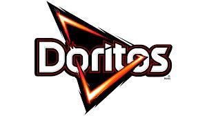
Image Source
In 1964, a food company named Frito-Lay introduced Doritos, a tortilla snack. The product was an immediate success. However, it wasn’t until the introduction of the taco and nacho cheese flavors in 1966 and 1977 that Dorito’s popularity truly exploded.
By 1993 Doritos was raking in over $1 billion in annual retail sales, making it one of the best-selling snacks at the time. And today, Doritos remains one of Frito Lay‘s most successful brands and one of the world’s most popular tortilla chips snacks.
Similarly, the Doritos logo has also become iconic in its own right and is now widely recognized both within the United States and internationally.
The earliest iterations of the Doritos logo from 1964 to the early 1990s featured stylized text of the brand name against a background composed of differently shaped and sized rectangles. The famous “triangle/arrow” wasn’t until a redesign in the 1990s that the triangle became a more prominent design element.
Iterations from this point onwards varied significantly, and it wasn’t until an early 2000s redesign that the “fire” element was added to the logo. Finally, in 2013, Doritos introduced the version of the logo still in use, which incorporated several design elements from its many iterations over the years.
What we like: The Doritos logo is a design that truly captures the essence of the product. It communicates the brand’s bold, energetic, and playful nature, establishing a distinct brand identity that sets them apart from the competition.
Pro tip: While modern design trends often lean towards minimalism, don’t be afraid to try bold and dynamic designs.
17. BMW
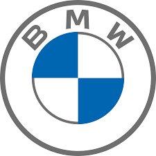
Image Source
BMW was founded in 1916, after a series of mergers and company conversions during the World War. The company initially started as an engine construction company but moved into motorcycle production in 1923.
This was an extremely successful move, and the BMW was a massive success at the Berlin Motor Show that year. Barely five years later, the company once again wandered into a new market — automotive construction — after acquiring a car manufacturer called Automobilwerk Eisenach.
During the following two decades, BMW experienced a series of challenges and achievements. However, it wasn’t until the introduction of the BMW 1500 in 1951 that the company began to witness a consistent streak of success.
Fortunately, unlike the company‘s journey, BMW’s logo has evolved relatively stable. In fact, the design has been incredibly consistent since the beginning. The very first versions of the logo up until today have retained the same circular shape and incorporated the BMW emblem.
What we like: BMW has maintained a consistent visual identity throughout history. This is especially impressive, considering how long the company has existed and its challenges over the years.
Pro tip: BMW demonstrates the importance of preserving a brand identity even in the face of challenges. Consider where and when you might want to do this in your redesign projects.
18. FedEx
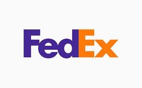
Image Source
Federal Express Corporation was founded in 1971 by Frederick W. Smith. Two years later, the company commenced operations in Memphis. There, it achieved an impressive feat (at the time) of delivering nearly 200 packages across the country in a single night.
By 1977, the company had purchased a fleet of Boeing 727s and was listed on the New York Stock Exchange the following year. Today, FedEx is a multinational conglomerate delivering millions of packages worldwide and bringing in over $90 billion in annual revenue.
Interestingly, FedEx has experienced very few logo redesigns in its wildly successful history. The initial logo prominently displayed the company’s full name, “Federal Express,” and used a white, red, and purple color palette.
Then in 1994, a redesign introduced the iconic red and purple color scheme and the concept of a “hidden arrow” within the logo.
In 2022, a slight update refreshed the design, maintaining its core elements.
What we like: FedEx’s hidden arrow is one of the most brilliant aspects of its logo design. This element perfectly communicates some of the brand’s fundamental attributes — speed, precision, and movement.
Pro tip: Allow your ideas space to expand, embrace experimentation, and work through as many iterations as you need. Sometimes moments of brilliance (and the occasional happy accident) will only happen if you give the creative process enough time.
19. Ford
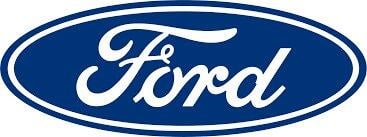
Image Source
Ford has come a long way since the quadricycle, the first vehicle designed by Henry Ford in 1896. The company introduced the Ford Model A in 1903, which became its first successful automobile.
This success was then followed up with the introduction of the Model T in 1927, a car that sold over 5 million units in the middle of the Great Depression.
Over the years, Ford expanded its portfolio by introducing several successful car brands, and in 1956, the company transitioned to a publicly traded business. Today, Ford manufactures commercial vehicles (under the Ford brand) and luxury vehicles (under the umbrella of the Lincoln Motor Company).
One of Ford’s earliest logos was designed in 1907 by Childe Harold Wills, an engineer that helped develop the cars alongside Henry Ford. This logo showcased the company name in a scripted typeface that became one of the defining elements of Ford’s logo design.
It wasn‘t until a 1927 redesign that the iconic Blue oval was incorporated into the logo and sported on a Ford vehicle. This new logo debuted on the newly redesigned Model T, renamed the Model A, in honor of the company’s first car.
Subsequent redesigns between 1927 to the early 2000s made slight changes to the font and depth of the design. However, a redesign in 2003 introduced a modernized version of the logo known as the “Centennial Blue Oval” to commemorate the company’s 100th anniversary.
What we like: Ford’s blue oval has become an iconic symbol synonymous with the brand itself. While the design may not be groundbreaking or especially exciting, it’s a great example of how unique design elements can become enduring symbols of a brand.
Pro tip: As a logo designer, focus on creating designs that can become enduring symbols in the minds of consumers.
20. Adobe
Image Source
Adobe released its first product, Adobe PostScript, in 1983. This product was a huge success and helped establish the company as one to watch. However, the release of Adobe Photoshop in 1989 truly solidified the brand’s position as the go-to software for digital imaging.
Over the years, the company introduced several revolutionary products such as Illustrator, Acrobat, Flash, and Premiere Pro. Today, Adobe is undoubtedly the most widely-used digital imaging software amongst individual and corporate users.
Marva Warnock, the wife of Adobe co-founder John Warnock, designed the company’s first logos, which featured the text “Adobe Systems” in a stylized wordmark placed inside a solid blue rectangle.
The next iteration was a 1990 version, which saw the rectangle stripped away and the text color changed from white to black.
Adobe’s color palette and the stylized “A” were introduced in future iterations that saw the logo move away from a simple wordmark to incorporate bolder elements. Each iteration also saw changes in the position of the wordmark and the use of colors in the design.
Today, Adobe’s logo combines elements from its earliest design, such as the wordmark, with recent additions like the stylized red letter “A.”
What we like: Despite being primarily a wordmark, Adobe’s use of the stylized red letter “A” in the designs has effectively transformed it from a generic wordmark into a memorable visual symbol.
Pro tip: Don’t be afraid to mix and match. Consider incorporating creative elements that can elevate your design when designing a logo.
Logo Inspiration Resources
Starting your design project is one of the most challenging aspects of creating a logo. So, if you still need guidance about where to begin, here’s a list of resources to find inspiration and creative ideas.
1. Creative Market
2. Dribble
3. Logoimport
Logoimport is an Instagram account that shares designs, illustrations, and graphic inspiration.
4. Behance
Tools for Designing a Brand Logo
1. Canva
Canva is an online graphic design tool offering a library of customizable logos.
Note: While some Canva templates are free, others may require a Pro account.
2. Logomakr
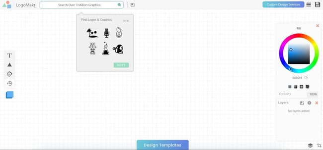
Image Source
Logomakr is a tool that allows you to design a logo from scratch with thousands of stock icons and hundreds of fonts. If that’s too much of a feat, you can use one of its templates and customize the text, color, and graphics to match your branding.
Although Logomakr is a free tool, you can pay for professional assistance should you need help designing your logo.
3. Logo Garden
Image Source
Logo Garden is a design tool that contains a vast library of graphics, fonts, and colors. If you get stuck along the way, the platform also offers design tips and videos to guide you.
4. GraphicSprings
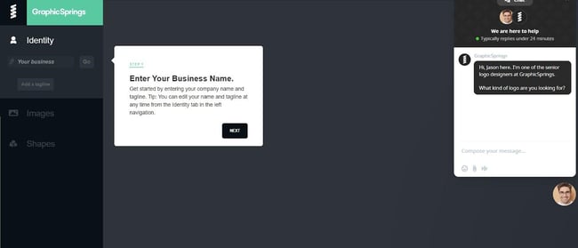
Image Source
GraphicSprings promises beautiful logos in three easy steps. First, pick a template from its library. Then edit the graphic and text of your logo with its easy drag-and-drop menu. Lastly, download your design for a small fee.
Voila, it’s that simple.
Creating an Effective Brand Logo
It’s always a good idea to study how other brands have modernized, evolved, or improved their designs, regardless of your experience as a designer.
Use the examples in this post as a guide, and find ways to uniquely incorporate the elements discussed in your next design.

Credit: Source link


