Besides your content, using one of the best fonts in your resume may help you get a recruiter’s attention. Studies have shown recruiters typically scan a resume for six to thirty seconds before deciding if an applicant is fit for a role.
With only a few seconds to demonstrate your qualifications for a position, every detail counts – including the font you use. The question is, what are the best resume fonts to pass the six to thirty-seconds scan?
We asked HubSpot recruiters to reveal the seven best fonts for your resume and what they consider in terms of design so your resume can stand out in a pile.
Expert Advice on Choosing the Right Font
Best Fonts for Resumes
Does Using The Best Resume Fonts Even Matter?
Worst Fonts for Resumes
Ideal Resume Font Sizes
Featured Resource: 12 Free Resume Templates
Download Now
Expert Advice on Choosing the Right Font
To evoke a sense of style, professionalism, and uniqueness, you must put effort and consideration into your font choice. When speaking with recruiters, it quickly became apparent that classic fonts are still the best options.
“I’m a big fan of the ‘classics’ for resumes – Times New Roman, Arial, Calibri, Helvetica, and Cambria. I’m a little old school, but I think they are the cleanest and exude professionalism,” said Johanna Fleming, a former senior recruiter at HubSpot.
Riley Kundtz, the former senior MBA campus recruiter at HubSpot, agreed.
“I find the classic formatting and Times font helpful when reading a dense resume from an experienced MBA candidate.”
Times New Roman has become a bit controversial lately. It was the go-to font for many years because it’s traditional and recognizable, but lately, some are opting against it.
“For me, it’s all about legibility and cleanliness – I prefer sans-serif fonts like Helvetica, which is modern and elegant, over serif fonts like Times New Roman,” says Glory Montes, a technical recruiter at HubSpot.
“Overall, I would just stay away from a font like Times New Roman; it’s overused and reminds me of long nights writing course papers in college,” adds Glory.
Georgia is one font The New York Times uses and is similar to Times New Roman. It’s a bit wider, making it easier to read.
Paulina Valdez Franco, executive recruiter at HubSpot, agrees with this take.
“My two favorite fonts are Helvetica if you’re looking for a clean and classic look, and Georgia, if you want a more modern and fun look,” she said. “The latter is also designed to read well on screens.”
Helvetica is widely used in advertising and works equally well for text-heavy pages and documents.
A lesser-known font that’s a great option for your resume is Garamond, recommended by our current team lead of engineering recruiting at HubSpot, Rich Lapham.
“Recruiters have an idea of the skills they are looking for on a resume, so if you try a new style or format, it can be tougher for recruiters to find the information they are looking for,” he said. “Keep it clean and simple.”
Franco added that Arial and Calibri are great choices to play it safe.
Bridget LeMon, HubSpot’s global emerging talent and university recruiting manager, echoes this.
“It’s totally acceptable – and becoming more common – for candidates to stray away from the resume norms of Times New Roman and Calibri,” she said. “Avenir Next and Muna are two excellent font options if you are looking to break the status quo.”
Ultimately, you‘ll want to consider the position you’re applying for when choosing a font. To Glory Montes’ point, certain more creative roles might benefit from a unique font than Times New Roman.
1. Times New Roman
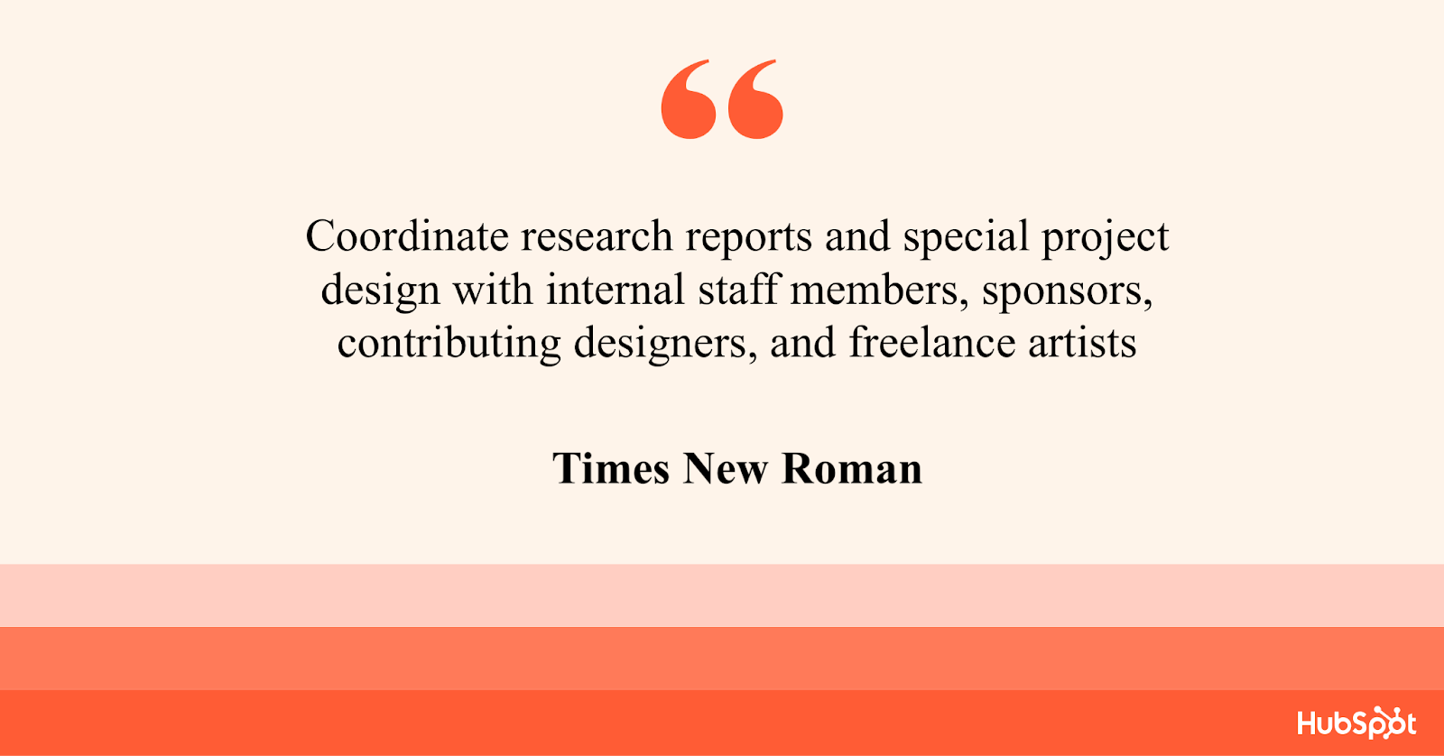
Times New Roman font has been popular for resumes for decades. This serif option is easy-to-read and communicates formality. Online, the font is uniform and accessible across various platforms and operating systems.
Advantages
Times New Roman has a classic and professional look, making it an excellent choice for applicants targeting corporate positions. Additionally, it is a standard font used in most word processors, making it an accessible option for any device.
Moreover, Times New Roman is easily readable in print and on-screen.
Best for: Word documents. PDFs can host unique fonts. However, a standard font will be helpful if your resume is uploaded as a Word document.
Disadvantages
The font’s outdated look may not appeal to all industries, and some may consider it bland or generic. Additionally, this font may make your resume blend in with the rest due to its ubiquity.
Times New Roman is also a heavy serif font, taking up more space than other options.
2. Arial
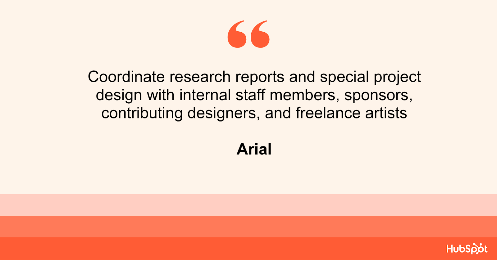
Arial is a sans-serif font that has become popular for its clean and modern look. Arial’s straightforward and minimalist design has made it a popular choice for applicants targeting creative positions.
Advantages
Arial offers simplicity, which allows your content to stand out. Arial’s legibility in small font sizes, even in print, makes it ideal for applicants trying to fit all the necessary information in their resume on a single page.
Best for: Resumes submitted online, where readability is essential for Applicant Tracking Systems (ATS) used in recruitment.
Disadvantages
The font’s overuse in branding and design has led to its association with a non-innovative style. This may make your resume less attractive to recruiters looking for unique personalities who can bring new ideas to their team.
Arial’s uniformity may not suit industries such as graphic design or creative writing seeking to showcase creativity and flair.
Conversely, Arial may make the text appear less formal and inappropriate for specific job applications.
3. Avenir Next
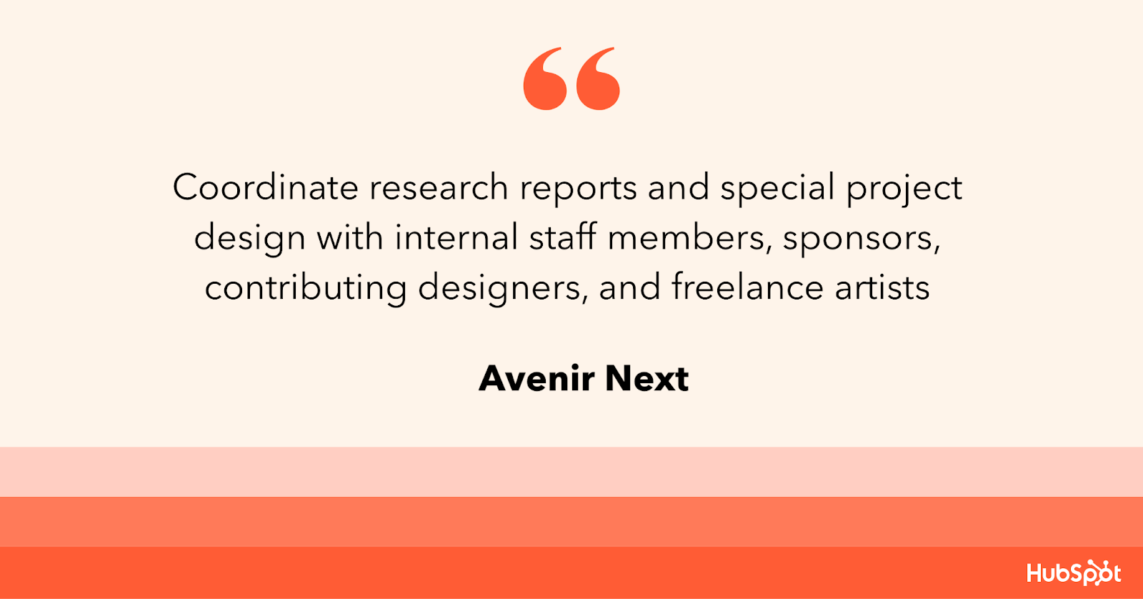
Avenir Next is a modern typeface gaining popularity among designers and recruiters. Avenir Next’s appearance is characterized by its geometric shapes, open contours, and strong lines.
Its clean, contemporary look has become a popular font choice for resumes.
Advantages
Avenir Next’s sleek and modern design makes it an excellent choice for applicants targeting creative industries. Its clear, simple lines offer a sense of elegance, while its legibility gives recruiters a sense of professionalism.
What we love: Avenir Next is a scalable font. It maintains its readability even at small sizes, and its geometric shapes make it a perfect choice for digital resumes.
Disadvantages
Avenir Next may not be as widely recognized, which could make it difficult to read on some computer systems without the font installed. Further, Avenir Next is a premium font with a higher price tag.
This might not be affordable for some applicants.
4. Helvetica
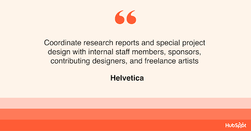
Helvetica is a widely recognized and popular font used on resumes, particularly in the design industry. It’s clean, classic, and timeless. This font is popular with professionals, design enthusiasts, typographers, and Wes Anderson.
Advantages
Helvetica is easy to read and has a professional, straightforward appearance. The font‘s popularity means that job recruiters and hiring managers are familiar with it.
Helvetica’s clean lines give the resume a structured and well-organized look, making it ideal for those in finance, law, and business management.
What we love: The font is available in multiple weights, making it easier to differentiate headings and sections in the resume.
Disadvantages
The font’s ubiquity in resumes may make it feel overdone and uninspired. With so many applicants using the font, your resume may struggle to stand out.
Helvetica‘s minimalist design can also work against you if your resume has limited content. This can make the resume look empty and as if it lacks substance.
5. Calibri
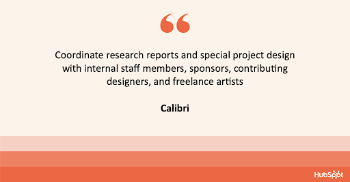
Calibri is a contemporary design, making it a popular choice for creating a visually appealing and easy-to-read resume.
Advantages
The font has been designed with legibility in mind, making it an excellent option for resumes.
Additionally, Calibri’s modern look creates a sleek and professional appearance, making it ideal for job seekers looking to highlight their contemporary skills and qualifications.
Calibri is also lighter than other font options, making it an ideal choice for job seekers trying to fit their resumes onto a single page.
What we like: Calibri offers a sense of uniformity across different platforms, making it an accessible and reliable option for applicants.
Disadvantages
Calibri is one of the default fonts available in most word-processing programs. Your resume might not appear as unique and tailored to your personal branding as it would with a more distinct font.
The font can be perceived as informal, making it less than ideal for formal industries, like law or finance, where a more traditional look would be preferred.
6. Cambria
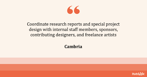
Cambria’s classic design features elegant serifs, making it a perfect choice for job seekers. You can easily create a traditional, professional-looking resume that stands out.
Advantages
Cambria has a classic yet modern appearance. The font‘s serifs give it a timeless look that is perfect for job seekers in more traditional industries such as finance or law.
Additionally, the font is highly readable, even in smaller font sizes, which makes it an excellent choice for job seekers looking to fit more information on their resumes.
What we like: Cambria’s generous spacing between characters and lines makes the resume much easier to read and stands out from other fonts.
Disadvantages
Some recruiters and hiring managers might view the font as old-fashioned or generic. Further, Cambria’s heavy serifs may be problematic for those trying to keep their resume to a single page as it can take up more space than other fonts.
7. Georgia
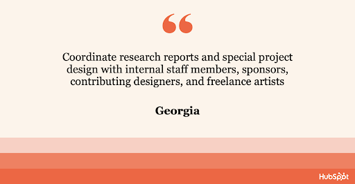
Georgia is a traditional serif font that has been a popular choice for resumes due to its elegant and classic look. Georgia’s unique design features distinguishable serifs that give it a professional appearance.
Advantages
Georgia’s design is easy to read even in smaller font sizes, making it a perfect choice for job seekers trying to highlight their accomplishments in a limited space.
Additionally, Georgia can be customized, which makes it an excellent option for applicants looking to add their personal touch.
What we like: The font’s design combines traditional and modern aesthetics, making it a versatile option for job seekers applying for a wide range of positions.
Disadvantages
The font’s traditional appearance may not be suitable for applicants targeting creative or non-traditional fields, where a more contemporary font may be preferred.
Also, Georgia is a serif, making it difficult to read in small sizes on a digital screen. This might not be the best option for those mainly applying online.
Does Using The Best Resume Fonts Even Matter?
Most recruiters I spoke with were hesitant to offer a font. Instead, they focus on the content.
“I rarely pay too much attention to fonts,” said Heta Patel, a former HubSpot recruiter. “I’m more concerned to see a resume that’s formatted neatly – submitting a PDF is helpful with this, so your formatting doesn’t shift.”
Sales Recruiting Manager Kelsey Freedman agreed.
“Honestly, I care little about the font of a resume, as long as it’s clear and in PDF format,” Freedman said. “I typically review a resume for 20 to 30 seconds, so a traditional font is good.”
Freedman continued, “I would advise avoiding script font or bubble font, or similar fonts that are distracting.”
Ultimately, and as expected, your content still matters most. However, a clear font will help avoid any irritability you might cause a recruiter with a distracting, messy design.
“What I get most excited about is the content. Depending on the role, I look to see that candidates are sharing direct and compelling snapshots of their work,” said Ashley Hodder, a global recruiting manager at HubSpot.
“I look for indicators that show data orientation, autonomy, and thoughtfulness about business impact,” she said.
Worst Resume Fonts
While some recruiters may not have suggestions for the best fonts, many can agree on some of the worst ones.
“Anything that is cursive or too bubbly is too hard to read. For instance, I’d stay clear of Comic Sans,” says Holly Peterson, team lead for UX recruiting HubSpot.
Another resume font type to avoid is Script.
With text-heavy documents, Scripts, and any of their derivatives make text hard to read because they look like they’re written by hand.
They’re generally used in hand lettering and calligraphy for artistic projects and shouldn’t be present anywhere near your resume.
Ideal Resume Font Size
When asked which font size is best, Fleming said 12 is ideal. Most recruiters would agree.
Your text should be large enough to read comfortably without straining but small enough that there’s space to include all key elements, such as your objective, contact information, skills, and experience.
You can use larger font sizes for headings containing your name and section titles.
If your font is extensive, you can scale to 10.5 – but never go below it.
The critical takeaway is to make your resume clear and easy to read, which means keeping the font size around 12, sticking to classic fonts with modern twists, and forsaking your favorite script font.
Now that you know the best fonts for your resume, use these tips to write your resume and ignite your creative spark with this ultimate collection of resume templates.
Editor’s note: This post was originally published in November 2018 and has been updated for comprehensiveness.
Credit: Source link


