Designing your company website can be a challenging proposition. You’ve got to juggle the expectations of many stakeholders, and you can often hit obstacles that prevent new ideas from emerging.
I was the design manager for a large company website for nearly six years, and during that time, I found myself losing perspective of what our target audiences really needed. Call it “tunnel vision.” When you work on the same website, it often helps to take a step back and think through new approaches. That’s the purpose of this blog post.

What follows are some tips, tricks, shortcuts and general advice for creating great website design. Can you try any of these to take your web design to the next level?
1) Design in shades of gray, then add color
If your web designer creates wireframes prior to visual designs, then you know the value of starting with shades of gray. Turn your wireframe into a grayscale visual design, add your photography, then carefully add color to design elements one at a time.
This will prevent an “overdesigned” website and help to place prominence on just the items that need it.
2) Use Keynote (Mac) to create rapid page prototypes
You don’t need Photoshop to create rapid prototypes of web pages, landing pages, call to actions or other web interface elements. There’s an entire underground movement around using Keynote (that’s Apple’s version of PowerPoint) to create mockups.
There’s even an online repository containing user interface design templates for wireframing, prototyping and testing mobile and web apps in Keynote.
3) Add web fonts to your corporate style guide
It’s 2015, and if your corporate style guide doesn’t include web fonts, then you need to look into adding those so your website has the same governance that corporate documents and collateral does.
If you haven’t looked into this yet, Google Fonts is a great place to start. Find a suitable web font and define usage in your corporate style guide so you use it consistently online
4) Bury those social media icons
You did all that work to get people to your website, and yet you’re inviting them to leave? That’s what you’re doing when you place social media icons in a prominent location of your website, like in the header. Bury the icons in the footer.
If people are on your website, you want them to stay, learn and perhaps inquire about your services, not check out company picnic photos and bowling outings on Facebook. Social media should send people to your website, not vice versa.
5) Ditch the slideshow/carousel
When the homepage slideshow/image carousel came into fashion, it was a way to get lots of information on the first page of your website. The problem is that most people don’t stay on the page long enough to experience all of the tiles/messages.
What’s more is that the messages and images usually aren’t relevant to your prospect’s first visit. What’s the one thing a visitor should take away from their website visit? Promote that one thing — usually what your company does in layman’s terms — and ditch the rest.
6) Simplify navigation
Reducing your visitors’ options might seem counter intuitive, but it can actually help guide people to your most productive content. Rather than overwhelming your website visitors with links to every page, simplify your navigation.
Eliminate dropdown menus and especially multi-tier dropdown navigation that only the most skilled mouse user can navigate, and go a step further by reducing the number of links in the header or sidebar of your website.
7) Remove sidebars
The sidebar has been an especially popular web design trend for the last ten years, especially on blogs. Many companies are finding that when they remove sidebars from their blogs, it encourages reader attention to the article and the call to action at the end.
Removing the sidebar on our company blog has increased the number of clicks on call to action graphics over 35%.
Try implementing this tactic by checking out the new Content Hub theme collection on the Envato marketplace.
8) Get color inspiration from nature
Struggling to find the perfect color combination for your website or a call to action graphic? Get your inspiration from nature. You can either use your own camera to photograph natural wonders around you or find landscape photos on the web, the use a color picker to select a color. Nature’s color palette never fails.
9) Step away from the computer
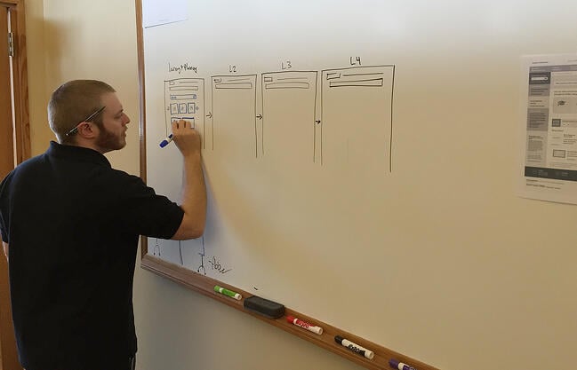
I believe that good design starts with great planning. Getting your ideas down on paper or on a whiteboard can help you iterate through a design, refining it and adding detail as you go along. Drawing on a whiteboard can also make the design process collaborative and allow other team members to give input.
It’s also easy to erase pencil from paper or marker from a whiteboard and make quick changes, and once you have something concrete to work with, snap a photo with your mobile phone and get to work on screen.
10) Use Pinterest to create mood boards
When you’re putting together inspiration and ideas for a new website, or you’re redesigning part of your website, you need a way to collect your inspiration in one place for future reference.
Did you know that you can use Pinterest to create a mood board of your favorite images, colors, layouts, patterns, sample websites and concept material? Another great advantage of using Pinterest is that other designers create and share mood boards too, and they’ve already curated a ton of resources that you can use.
11) Increase your font size
Typography is incredibly important in web design. Text is hard enough to read on a computer screen, so you have to make the important things stand out.
One way to do this is to increase your font sizes, especially for headings and important blocks of text. Consider increasing the size of your normal font, too.
12) Use white space
It may be hard to believe that using whitespace is a hack, but I evaluate websites every day that could use more whitespace. Not every blank area of the screen needs to be filled.
Even though whitespace and simplicity are in style right now, too many companies try to cram everything into a small space, or worse yet, “above the fold.” Give your design room to breathe, and your website visitors will be able to find things easier.
13) Use the squint test
Want a quick way to learn what’s most prominent on your website? Back away from your computer screen and squint. Most everything will become blurry, and only the larger, colorful, more prominent features will be noticeable.
It’s said that this technique helps a designer understand what a first-time visitor may notice when he scans your website. Will the visitor notice what’s most important?
While this is a big blog post about little design hacks, I’m sure you have some hacks of your own that I haven’t thought of here. What’s your favorite design hack? Why not share it in the comments below? Let’s see how many you can add!
![Blog - Website Redesign Workbook Guide [List-Based]](https://no-cache.hubspot.com/cta/default/53/4b5bb572-5d0e-45b8-8115-f79e2adc966b.png)
Credit: Source link